Improving Billa’s
Self Checkout
Customer Experience
Before I start, let me ask you, dear reader, what’s the purpose of a self-checkout kiosk?
If you answered “To save time” then you and I think alike.
Personal Portfolio
Project
Personal Portfolio
Project
Personal Portfolio
Project
Billa's self checkout kiosk is confusing and difficult to navigate and results in poor CX.
Billa's self checkout kiosk is confusing and difficult to navigate and results in poor CX.
Billa's self checkout kiosk is confusing and difficult to navigate and results in poor CX.
Enhance the UX and CX by improving the design and hierarchy of elements in the UI.
Enhance the UX and CX by improving the design and hierarchy of elements in the UI.
Enhance the UX and CX by improving the design and hierarchy of elements in the UI.
Better and faster UX=more sales and better customer satisfaction.
Better and faster UX=more sales and better customer satisfaction.
Better and faster UX=more sales and better customer satisfaction.
Not in the mood for reading? Click here to scroll down to the finished concept.
Not in the mood for reading? Click here to scroll down to the finished concept.
Not in the mood for reading? Click here to scroll down to the finished concept.
And so...
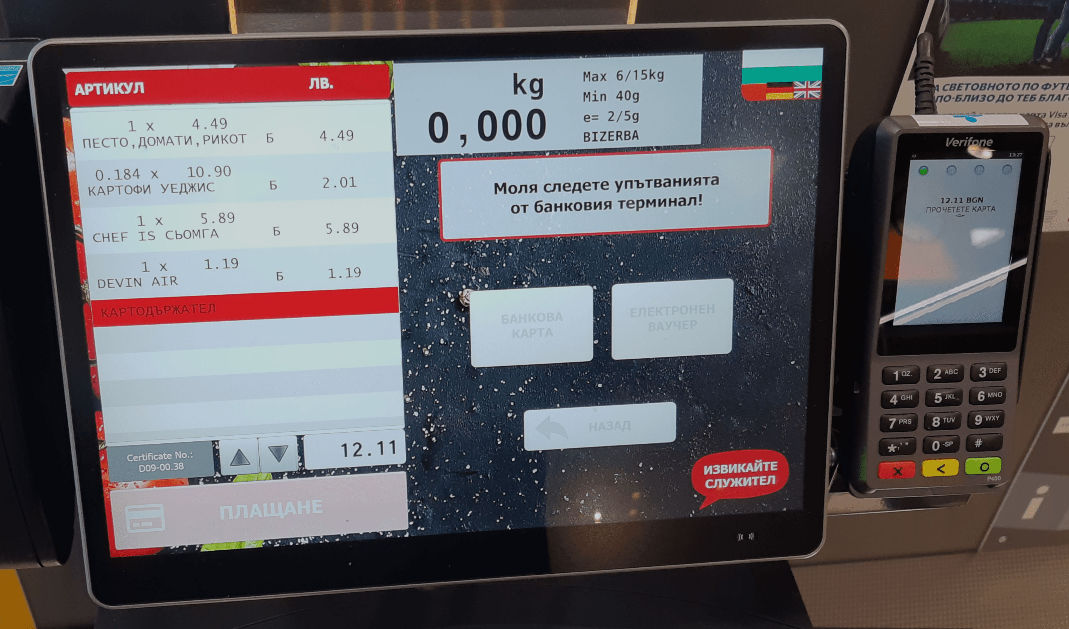
My local Billa store recently introduced self-checkout kiosks (great addition), but not one without issues...
I’ve narrowed it down to a few things.
1.Products are listed on the left side of the screen.
People in the west read and scan information from left to right, not to mention, we’re used to seeing our “shopping cart” on the right side of screens.
2.Customers can’t remove items from their cart.
If a customer accidently chooses or scans the wrong product, there is no way to remove it from their cart, and they have to press a button which alerts a nearby cashier, and hope they respond fast. I’ve waited for upwards of 10 minutes to remove a single extra bagel!
3.The interface is a bit clunky.
The kiosk itself doesn’t pass a11y checks, and the textured background image increases visual clutter and confusion. There’s also a bunch of alignment and hierarchy issues.
4.Menus on top of menus.
Billa offers a specialty card that gives discounts and in order for it to be scanned, the customer has to go
press 2 different buttons. Paying is also slower than expected.
1.Products are listed on the left side of the screen.
People in the west read and scan information from left to right, not to mention, we’re used to seeing our “shopping cart” on the right side of screens.
2.Customers can’t remove items from their cart.
If a customer accidently chooses or scans the wrong product, there is no way to remove it from their cart, and they have to press a button which alerts a nearby cashier, and hope they respond fast. I’ve waited for upwards of 10 minutes to remove a single extra bagel!
3.The interface is a bit clunky.
The kiosk itself doesn’t pass a11y checks, and the textured background image increases visual clutter and confusion. There’s also a bunch of alignment and hierarchy issues.
4.Menus on top of menus.
Billa offers a specialty card that gives discounts and in order for it to be scanned, the customer has to go press 2 different buttons. Paying is also slower than expected.
So how do we solve these issues? Let's start with defining the main purpose of a terminal.
So how do we solve these issues? Let's start with defining the main purpose of a terminal.
So how do we solve these issues? Let's start with defining the main purpose of a terminal.
A self checkout kiosk’s (terminal) main purpose is to save time and drive sales.
No one wants to wait in line. Sometimes, I’d walk in a store and see the giant queues... and I would walk out...
This is a direct loss for the store and why self checkout kiosks exist - to drive FASTER sales, so the purchase per customer number can increase, ultimately resulting in larger sales and increased revenue.
That means that the customer experience at the kiosk needs to be as smooth and fast as possible, and unfortunately Billa’s solution isn’t as effective as it should be.
At first, I thought it was a “me” problem, but then I’d see other customers struggle to navigate the menu and after a while the lines started getting bigger and bigger...
So, I decided to see if I could improve it.
At first, I thought it was a “me” problem, but then I’d see other customers struggle to navigate the menu and after a while the lines started getting bigger and bigger...
So, I decided to see if I could improve it.
At first, I thought it was a “me” problem, but then I’d see other customers struggle to navigate the menu and after a while the lines started getting bigger and bigger...
So, I decided to see if I could improve it.
Here’s the main solutions I came up with.
Here’s the main solutions I came up with.
Here’s the main solutions I came up with.
Buttons have to be REALLY BIG, taking advantage of Fitt’s law. In a nutshell,
the bigger the button the easier it is to use.
Buttons have to be REALLY BIG, taking advantage of Fitt’s law. In a nutshell,
the bigger the button the easier it is to use.
Buttons have to be REALLY BIG, taking advantage of Fitt’s law. In a nutshell,
the bigger the button the easier it is to use.
Interface needs to be better aligned, with a better hierarchy to reduce confusion,
save time and increase the purchases per customer.
The new design must allow for the customer to troubleshoot on their own,
without relying on staff for help.
The new design must allow for the customer to troubleshoot on their own,
without relying on staff for help.
The new design must allow for the customer to troubleshoot on their own,
without relying on staff for help.
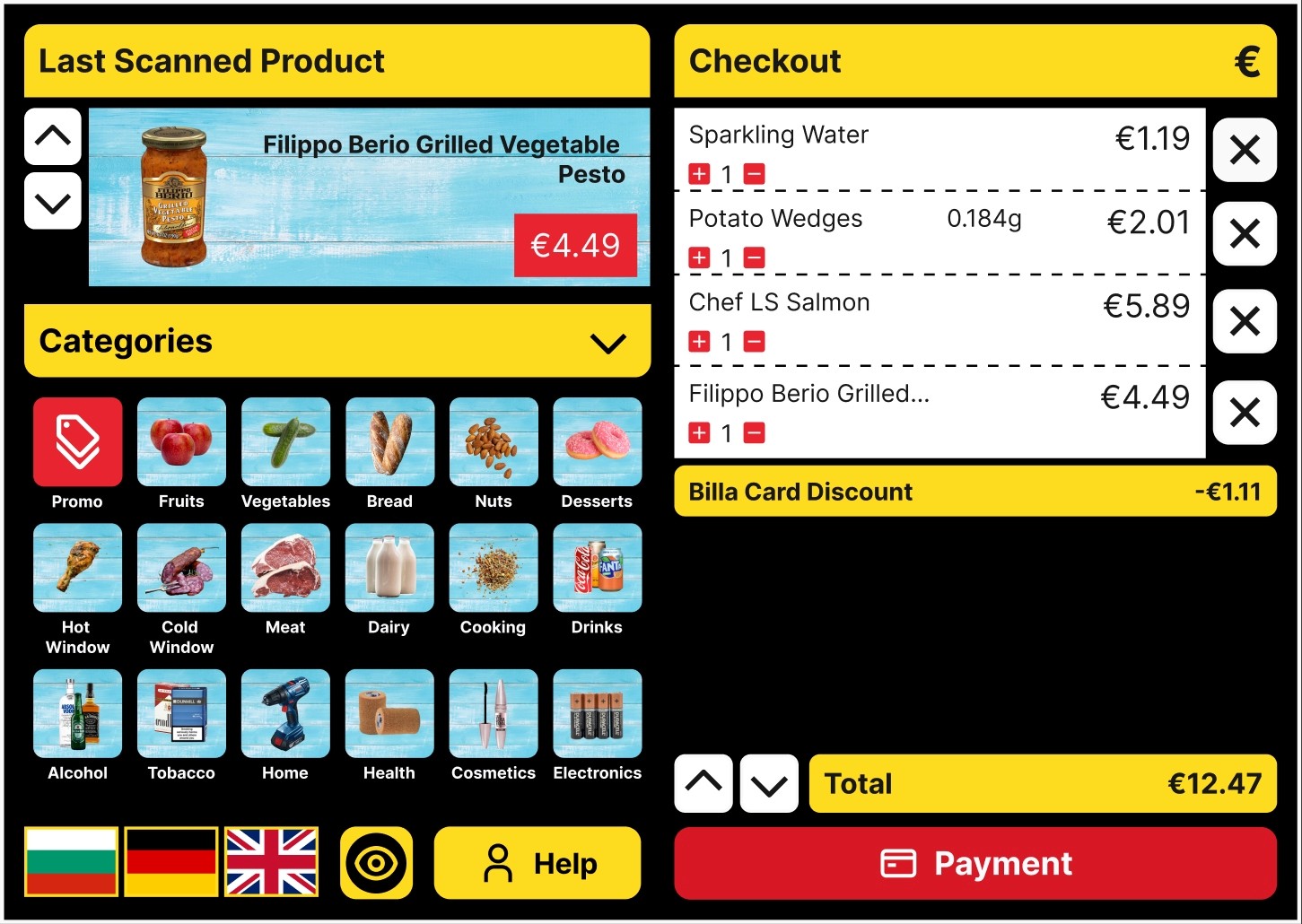
With the help of Jakob’s law products are now on the “right” side of the screen.
With the help of Jakob’s law products are now on the “right” side of the screen.
With the help of Jakob’s law products are now on the “right” side of the screen.
The amount of products in the cart can now be increased or they can be removed altogether.
I used yellow to distinguish the interface from other competitors, added black for contrast and gave the CTA a distinct red color.
I added a collapsible product categories section underneath the “last scanned product” portion of the design to make them easier to access.
I added an a11y toggle that maximizes contrast to assist visually impaired customers.
The CTA button, promo icon and price all share the same color, used sparingly to guide the customer’s eye.
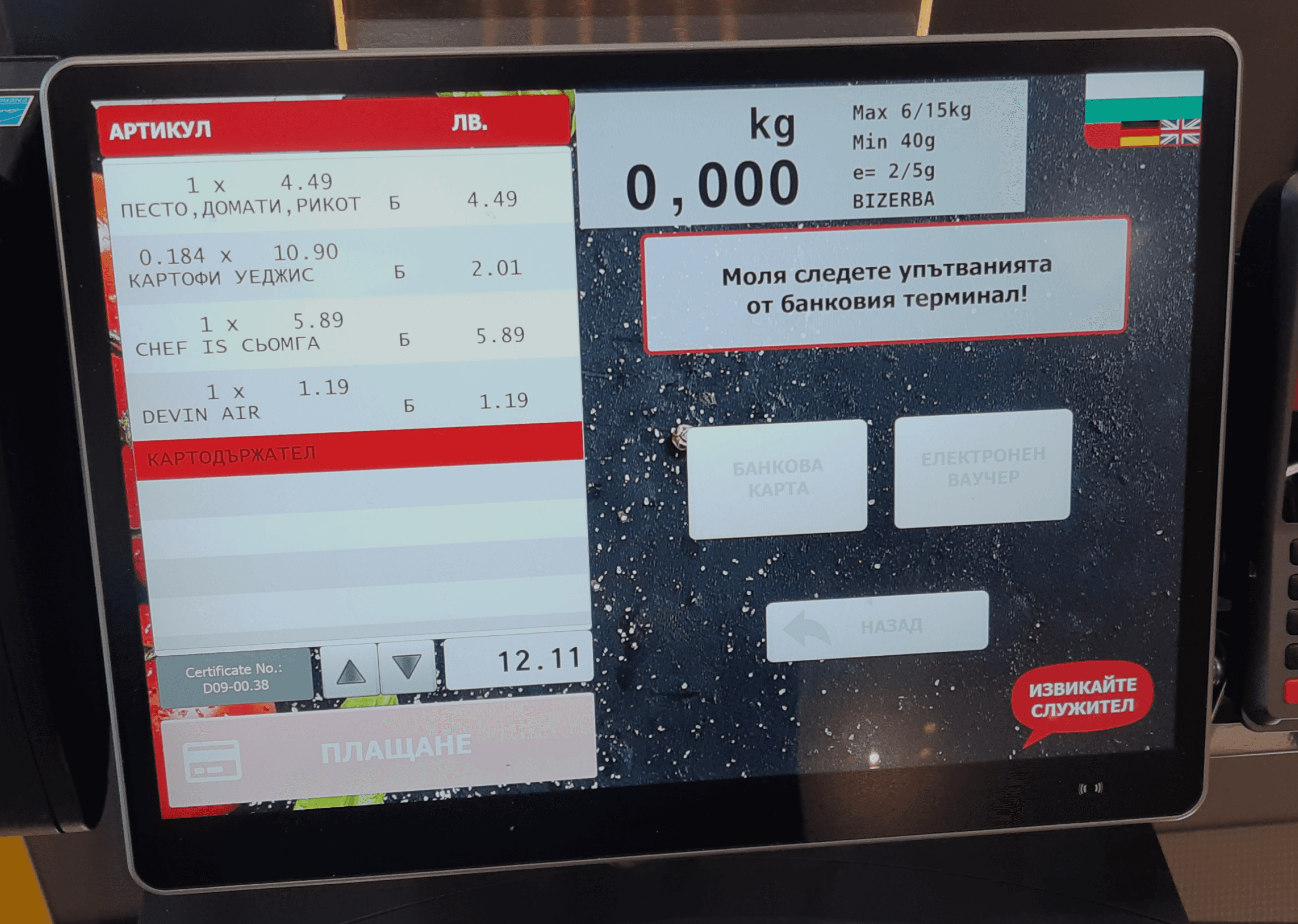
Here’s the two interfaces compared.
Here’s the two interfaces compared.
Here’s the two interfaces compared.
And here's the A11Y version.
(in video)
And here's the A11Y version.
(in video)
And here's the A11Y version.
(in video)
In Conclusion
Self checkout kiosks are great, but they can also become a detriment to a business if deployed in a sub-par way. This little project taught me a lot about designing with constraints in mind and piecing things together with the end goal in mind.
Thank you for scrolling so far!
if you wanna chat you can find me at
if you wanna chat you can find me at
if you wanna chat you can find me at


